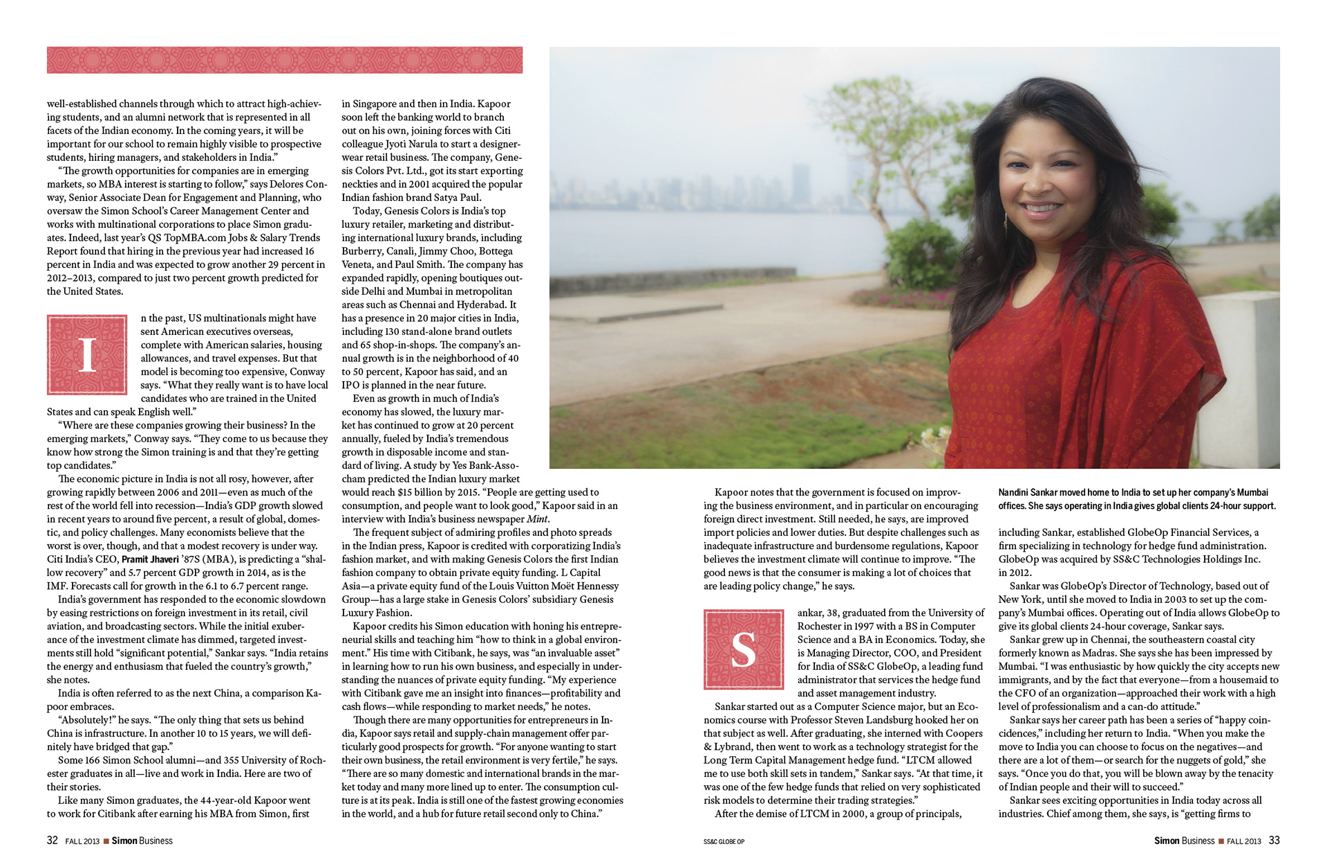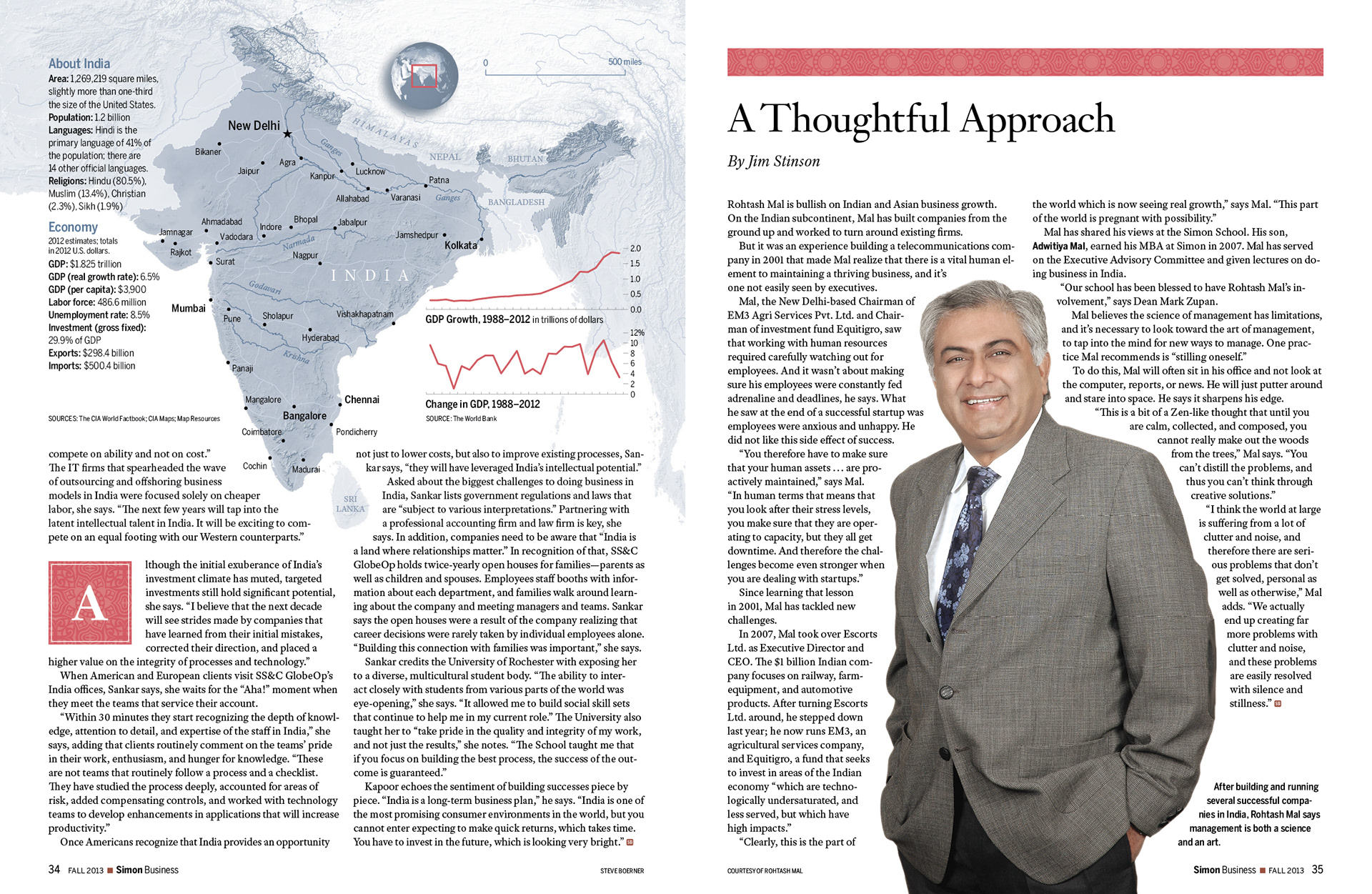
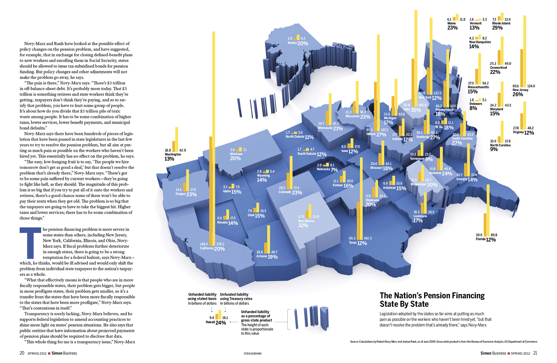
Research data provided by the subject was turned into a three-dimensional infographic to show the severity of each state's pension problems, and also to illustrate the difference between traditional measurements (that understate the problem) and those based on a new set of benchmarks.

Illustration was created by combining an aerial landscape with a three-dimensional rendering of flying newspapers. The newspapers were modeled and rigged in Autodesk Maya.
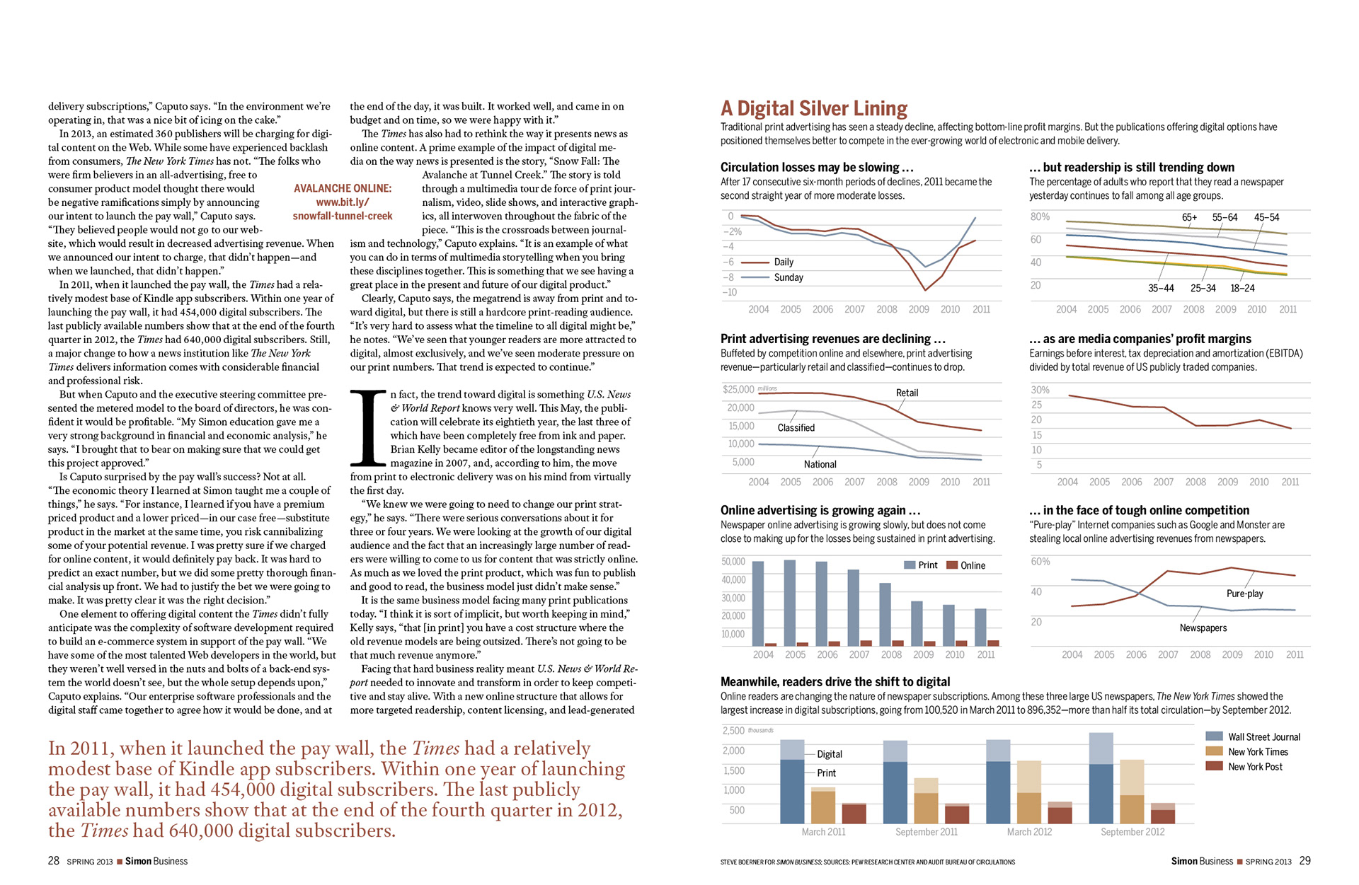
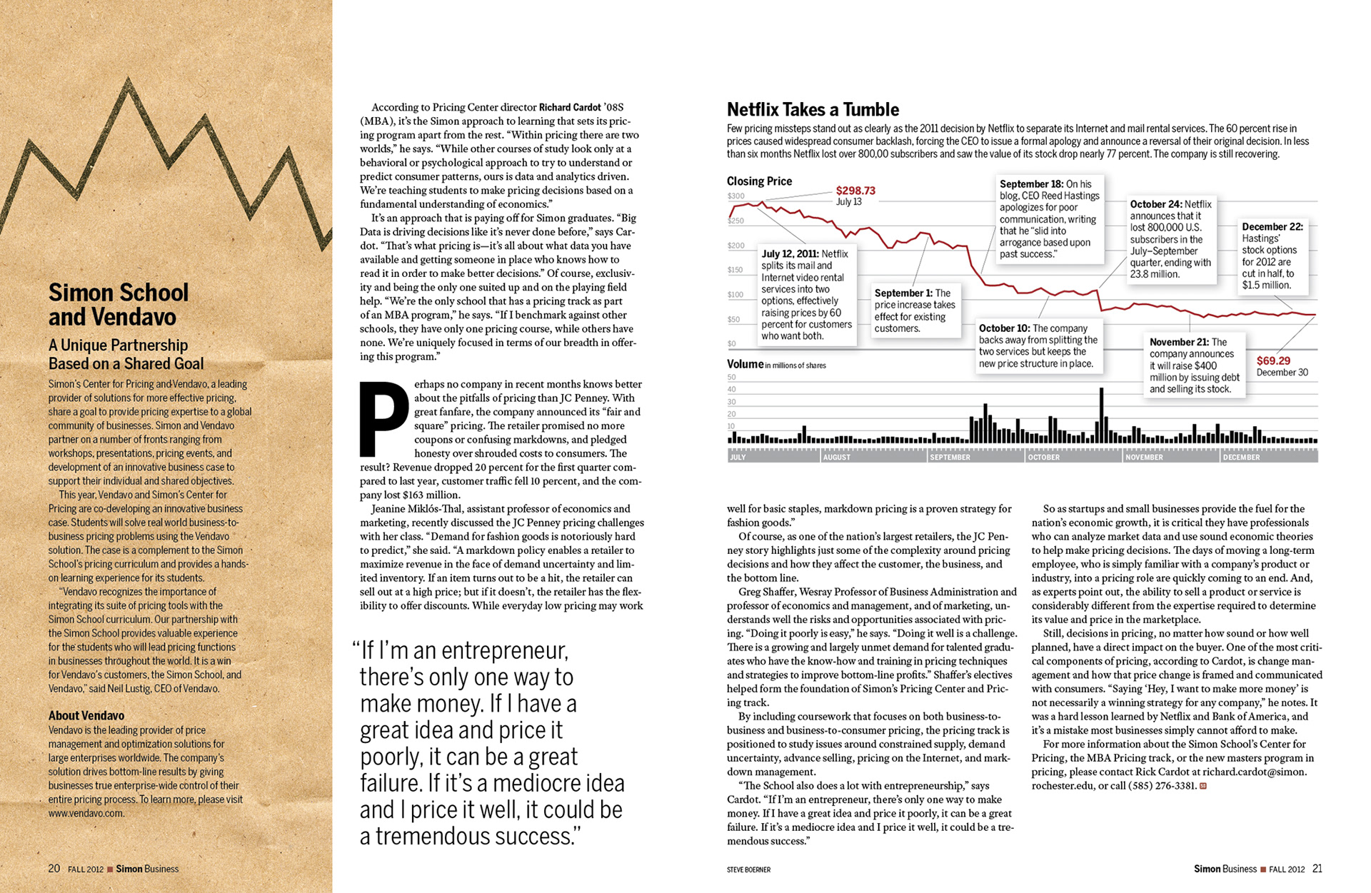
Data provided by Pew Research and the Audit Bureau of Circulations was combined in a storytelling fashion to explain how—and why—print advertising revenues are falling and how readership is shifting to digital media.